
Students interpret real WeCoExist dashboard data to understand how their classroom bin fills over time.
Download Worksheet 2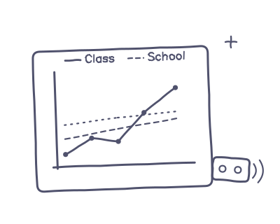
Students use their classroom to investigate how full their bin becomes over time. By reading percentages, interpreting graphs and identifying patterns, they learn how real sensor data can help explain what happens in their classroom each day. Students then calculate an average and use evidence from the data to predict tomorrow's fill level.
→ Reading percentages
→ Graph interpretation
→ Data analysis
→ Making predictions
→ 60 Minutes
(+ 5 minute follow-up)
→ Print Worksheet 2
→ Open classroom dashboard
→ Check recent data
→ Screenshot graph (backup)
Before class, spend a few minutes preparing the dashboard and classroom materials.
→ Worksheet 2
→ Dashboard or printed graph
→ Calculators
→ Class Device ID
→ Send a reading before the lesson so the live value is fresh
→ Check 5 days of data
→ Screenshot graph (backup)
→ Confirm device is reporting
→ Plug the device in at the start of the lesson — averages include it after the next hour ticks over
→ Search using your Class Device ID
→ Check recent data is visible
Follow these four stages to guide students through the investigation.
Students search for their class using the Device ID, then record the current fill level and Last Updated time.
Students read the graph and record the fill level for each of the last five school days.
Students identify the highest and lowest days, calculate the average and describe the overall trend.
Students predict tomorrow's fill level and explain their reasoning using the data they have collected.
Use these questions to encourage observation, reasoning and discussion throughout the investigation.
How full do you think our bin is?
What makes you think that?
Will today's reading surprise you?
Which day was the fullest?
Which day was the emptiest?
What pattern can you see?
Why might one day produce more rubbish?
Why might the graph suddenly drop?
Why might the graph stay flat? Did you check Last Updated?
Why is our device's reading newer than the averages?
Help students interpret dashboard data carefully before drawing conclusions.
→ Check percentages before answering.
→ Read the whole graph.
→ Check Last Updated.
→ Compare several days.
→ Calculate the average.
→ Explain trends using evidence.
→ A flat line shows the last reading until the next device update.
→ A flat line doesn't always mean nothing changed.
→ Use the graph and Last Updated together when interpreting the data.
→ Class and School Averages update each hour, once the hour has finished — your device's own line may be newer.
Everything you need to deliver Investigation 2 is given below.
Use these opportunities to check students' understanding throughout the lesson.
Students accurately read percentages and values from the dashboard graph.
Students explain patterns, identify trends and justify their predictions using the data.
Students calculate the average correctly and explain what it tells them about their classroom's waste.
Students have explored how their classroom bin fills over time. Next, they'll investigate how simple actions can reduce waste and measure the impact using their WeCoExist dashboard.